Teaching Students R and ggplot
High School Students Should Learn To Visualize Data


Beginning in the new year, my Algebra II and Precalculus classes will start our unit on statistics and I will be introducing my students to R programming and RStudio. I'm going to adjust my lesson plan from last year to give them more time in setting up R and RStudio. The first thing to do is to get them to download R from CRAN. Then we can begin.
I have another lesson plan for them to install ggplot and tidyverse. Last year, my students did a good job of getting this done.
When teaching ggplot to my students, I like to start with a simple example to help them understand the basic structure of a ggplot object. I usually begin by showing them how to create a basic scatterplot using the ggplot function and the geom_point layer.
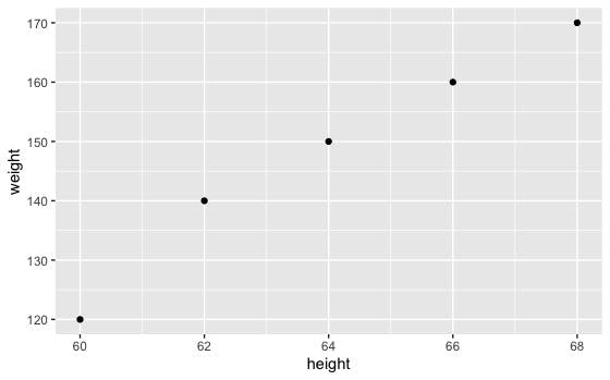
For example, I might use the following code to create a scatterplot of height versus weight for a group of individuals:
# Load the ggplot2 and tidyverse packages
library(ggplot2)
library(tidyverse)
# Create a data frame with height and weight data
df <- data.frame(height = c(60, 62, 64, 66, 68),
                 weight = c(120, 140, 150, 160, 170))

# Use ggplot to create a scatterplot of height vs weight
ggplot(data = df, aes(x = height, y = weight)) +
  geom_point()
Once my students have a basic understanding of how to create a scatterplot using ggplot, I like to introduce them to the different types of layers that are available in the package.
For example, I might show them how to add a line of best fit to the scatterplot using the geom_smooth layer, or how to change the appearance of the points using the color and size arguments. I might also introduce them to other types of plots, such as bar charts and histograms, and show them how to customize the appearance of these plots using various options in ggplot.
Overall, my goal is to give my students a solid foundation in ggplot so that they can use it to create a wide range of visualizations for their own data. I find that using simple examples and gradually building up to more complex plots helps my students to understand the underlying principles of ggplot and how to use it effectively.
https://www.tieonline.com/article/3185/data-visualizations-for-schools